Textbook for Excel Exam

Introduction
In the world of data engineering and business intelligence, Microsoft Excel remains the ubiquitous “first draft” of data analysis. While Python, SQL, and Tableau dominate big data pipelines, Excel is where the business world lives. It is effectively a functional programming environment coupled with a two-dimensional visual database.
This guide serves as a comprehensive “textbook” designed specifically for the Basics of MS Excel Course End Semester Examination. We are not just covering button clicks; we are deconstructing the architecture of Excel to ensure you can pass the MCQ Test (40 Marks) and the Workbook Submission (40 Marks) with distinction.
We will traverse the four mandatory units, treating the spreadsheet not as a grid of boxes, but as a development environment.
UNIT-I: The Excel Environment & Architecture
Before executing complex logic, one must master the IDE (Integrated Development Environment). In Excel, the interface is your IDE.
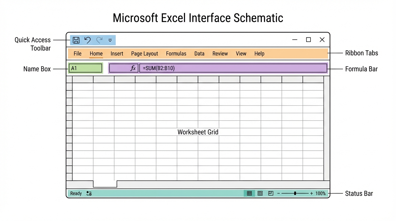
1. Anatomy of the Interface
The Ribbon & Quick Access Toolbar (QAT)
The Ribbon is organized into Tabs (Home, Insert, Data, View). Think of these as namespaces containing specific functions.
- Ribbon Display Options: Located in the top-right, allows you to Auto-hide, Show Tabs, or Show Tabs and Commands. Critical for maximizing screen real estate during complex modeling.
- QAT: The only customizable toolbar that persists across tabs. Pro Tip: Add “Paste Special” and “Filter” here for O(1) access.
The Formula Bar & Name Box
- Name Box: Located to the left of the formula bar. It usually displays the cell address (e.g.,
A1). However, it is primarily used for Named Ranges. Naming a cellTaxRateallows you to refer to it globally, eliminating “magic numbers” in your formulas. - Formula Bar: Your code editor. It handles formula input and debugging.
Views & Zoom
- Normal View: The default grid.
- Page Layout View: Visualizes printed output (headers/footers visible).
- Page Break Preview: Essential for defining print areas.
2. The Cell: The Atomic Unit
A cell is an object that holds properties: Value, Formula, and Format.
Formatting & Data Types
Excel attempts to infer data types (General), but explicit typing is required for data integrity.
- Number Formatting:
- Currency vs. Accounting: Currency allows custom placement of the symbol. Accounting aligns symbols to the left and decimals to the right for easier scanning.
- Dates: Stored internally as serial numbers (1 = Jan 1, 1900). This allows mathematical operations on dates.
Managing Structure: Rows, Columns, and Worksheets
- Worksheets: The individual pages. Copying a worksheet (
Ctrl + Drag) creates a complete fork of the data and logic. - Resizing: Double-clicking the boundary between column headers performs an “AutoFit,” adjusting width to the longest data string.
3. Keyboard Shortcuts: Speed Engineering
To pass the practical exam within the time limit, the mouse is your enemy.
| Shortcut | Function | Context |
|---|---|---|
Ctrl + Arrow |
Navigation | Jumps to the edge of data regions. |
Ctrl + Shift + Arrow |
Selection | Selects data from active cell to edge. |
Alt + = |
AutoSum | Inserts SUM() function automatically. |
Ctrl + 1 |
Format Cells | Opens the detailed formatting dialog. |
F4 |
Repeat/Lock | Repeats last action OR cycles absolute references ($A$1). |
UNIT-II: Formulas, Functions, and Tables
This unit moves from static data to dynamic computation.
1. Formula Syntax and Cell Referencing
A formula always begins with =. The most critical concept here is Relative vs. Absolute Referencing.
- Relative (
A1): Updates when copied. Used for iterating rows. - Absolute (
$A$1): Locked constant. Used for parameters (e.g., Tax Rate). - Mixed (
$A1orA$1): Locks only the column or row.
2. Library of Functions
Mathematical & Statistical
=SUM(A1:A10)        -- Aggregate total
=AVERAGE(B1:B20)    -- Arithmetic mean
=COUNT(C1:C10)      -- Counts cells with numbers
=COUNTA(C1:C10)     -- Counts non-empty cells (includes text)
Text Manipulation (String Functions)
Data often arrives “dirty.” These functions sanitize it.
- CONCAT: Joins strings.
=CONCAT(A2, " ", B2) - LEFT/RIGHT/MID: Extract substrings.
- TRIM: Removes leading/trailing whitespace (crucial for database matching).
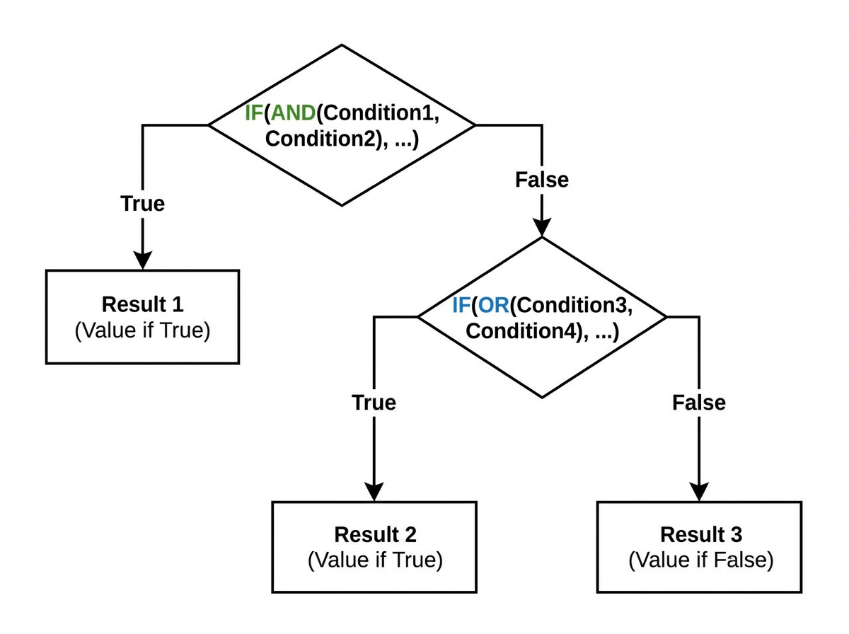
Logical Functions
The IF statement is the backbone of Excel logic.
Syntax: =IF(logical_test, value_if_true, value_if_false)
Nested Logic (AND/OR):
-- Return "Pass" if Score > 50 AND Attendance > 75%
=IF(AND(A2>50, B2>0.75), "Pass", "Fail")
3. Excel Tables (Structured References)
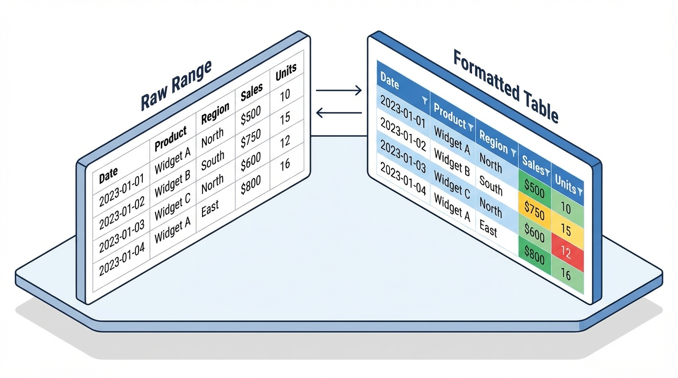
Converting a range to a Table (Ctrl + T) transforms standard cells into a database object.
Why use Tables?
- Dynamic Ranges: Charts and PivotTables built on Tables update automatically when new rows are added.
- Structured References: Formulas use column names instead of A1 syntax.
- Standard:
=C2 * D2 - Table:
=[@Price] * [@Quantity]
- Standard:
- Calculated Columns: Typing a formula in one row automatically propagates it to the entire column.
UNIT-III: Filters, Sorting, and Visualization
Once calculation is complete, data must be explored and presented.
1. Sorting and Filtering (The Query Layer)
Sorting
- Single Level: Basic A-Z.
- Multi-Level Sort: Sort by Department (A-Z), then by Salary (Largest to Smallest). Accessed via Data > Sort.
- Custom Sort: Sorting by non-alphabetical logic (e.g., High, Medium, Low). You must define a Custom List in File > Options.
Filtering
Filtering hides rows that do not match criteria.
- Text Filters: Contains, Begins With.
- Number Filters: Greater Than, Top 10.
- Date Filters: Next Month, Year to Date.
- Advanced Filter: Allows extracting unique records to a new location.
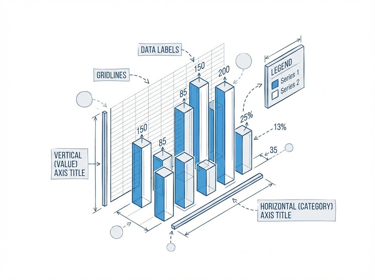
2. Charts: Data Visualization
A chart is a view layer on top of your data model.
Chart Types
- Column/Bar: Comparing categories.
- Line: Trends over time.
- Pie: Parts of a whole (Use sparingly; humans are bad at judging angles).
- Scatter: Correlation between two variables.
Chart Architecture
- Data Series: The actual values being plotted.
- Axes: The scale (X and Y). Formatting axis bounds (Minimum/Maximum) is crucial for emphasizing differences.
- Legend: Identifies the series.
- Chart Layouts: Pre-defined templates for quick styling.
Scenario: You need to plot Sales (Bars) and Profit Margin (Line) on the same chart. Solution: Use a Combo Chart. Set Sales to “Clustered Column” on the Primary Axis and Profit Margin to “Line” on the Secondary Axis.
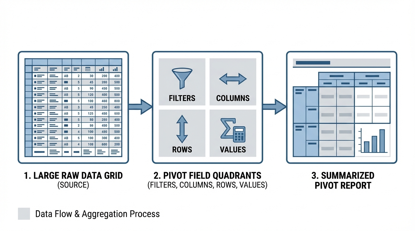
UNIT-IV: Pivot Tables & Advanced Reporting
Pivot Tables are the crown jewel of Excel. They function as an OLAP (Online Analytical Processing) tool, allowing you to summarize 100,000 rows of data in seconds without writing a single formula.
1. Creating a Pivot Table
- Select Data (preferably a Table).
- Insert > PivotTable.
- The Cache: Excel takes a snapshot of your data into a memory cache. Note: If source data changes, you must click “Refresh”.
2. The Four Quadrants
Understanding where to drag fields is key:
- Rows: Group data vertically (e.g., Region).
- Columns: Group data horizontally (e.g., Year).
- Values: The aggregation math (Sum, Count, Average).
- Filters: Global slicer for the report.
3. Manipulating Values
By default, Excel sums numbers and counts text. You can change this behavior:
- Summarize Values By: Change Sum to Average, Max, Min.
- Show Values As: Change raw numbers to % of Grand Total or Difference From. This is powerful for market share analysis.
4. Pivot Charts
A Pivot Chart is bound to the Pivot Table. Slicing the table (filtering) automatically updates the chart. This is the basis for creating interactive dashboards.
Exam Preparation Guide
Part I: MCQ Strategy (1.5 Hours)
Based on the referenced textbooks (Excel 2016 Bible, Excel 2019 All-in-One), expect questions on:
- File Extensions:
.xlsx(standard),.xlsm(macro-enabled),.csv(comma separated). - Error Codes:
#DIV/0!: Division by zero.#VALUE!: Wrong argument type (adding text to number).#REF!: Invalid cell reference (deleted row).
- Ribbon Locations: Which tab contains “Remove Duplicates”? (Answer: Data Tab).
Part II: Workbook Submission Strategy (40 Marks)
You will likely be given a raw dataset (e.g., Sales Data) and asked to perform specific tasks.
Sample Problem & Solution Workflow
Problem: “Calculate the commission for each salesperson. If Sales > 10,000, commission is 10%, otherwise 5%. Create a summary table showing total sales by Region.”
Step-by-Step Implementation:
- Data Entry & Formatting:
- Enter data. Format the ‘Sales’ column as Currency (
$). - Format the Header row (Bold, Background Color).
- Enter data. Format the ‘Sales’ column as Currency (
- Formula Logic (The
IFFunction):- In cell C2 (Commission), type:
=IF(B2>10000, B2*0.10, B2*0.05) - Double-click the fill handle to propagate down.
- In cell C2 (Commission), type:
- Pivot Table (The Summary):
- Select data. Insert PivotTable.
- Drag
Regionto Rows. - Drag
Salesto Values. - Format the PivotTable results as Currency.
- Printing/Output:
- Set Print Area.
- Insert Header with your Name/Roll Number.
- Scale to Fit (1 Page Width).
Conclusion
Passing the Basics of MS Excel exam requires moving beyond “guessing” which button to click. It requires understanding the object model—how cells relate to formulas, how ranges relate to charts, and how raw data flows into Pivot Tables.
Final Checklist for the Exam:
- Sanitize inputs: Check for extra spaces or stored-as-text numbers before calculating.
- Lock references: Always ask, “Should this cell reference move when I drag the formula?”
- Label everything: Charts without titles and axes labels are mathematically meaningless.
- Save frequently:
Ctrl + Sis the most important shortcut of all.
Master these four units, and you will not only ace the exam but possess a toolset valuable for any data-driven career.